How to Generate "Non-Oily" AI Images: 3 Anti-AI Style Guides

When I first started using AI image generation, I didn't pay much attention to style. Whatever Midjourney defaulted to, I used: rich lighting, flawless detail, vibrant colors. The result? Images that looked technically impressive but felt... wrong. They screamed "made by AI."
I spent months experimenting with prompts, stripping back parameters, testing different style combinations. After a lot of trial and error, I found the core principle: less is more, add texture, flatten, desaturate.
These three style recipes are the ones that worked best in practice. Just append the prompt suffix to your base prompt and you're good to go.
Why Do AI Images Look "Oily"?
You've probably noticed it too: AI-generated images that look technically "perfect" but have an uncanny "plastic" quality.
This "AI sheen" typically comes from:
- Overdone lighting and shadows — too dramatic, too deliberate
- Perfection in every pixel — lacking the imperfections of real art
- High-saturation colors — unnaturally vibrant
- 3D render vibes — looks like a game engine output, not human-made art
A Common Example
Say you need an illustration for a "reading" theme. Default AI prompts might give you something like this:
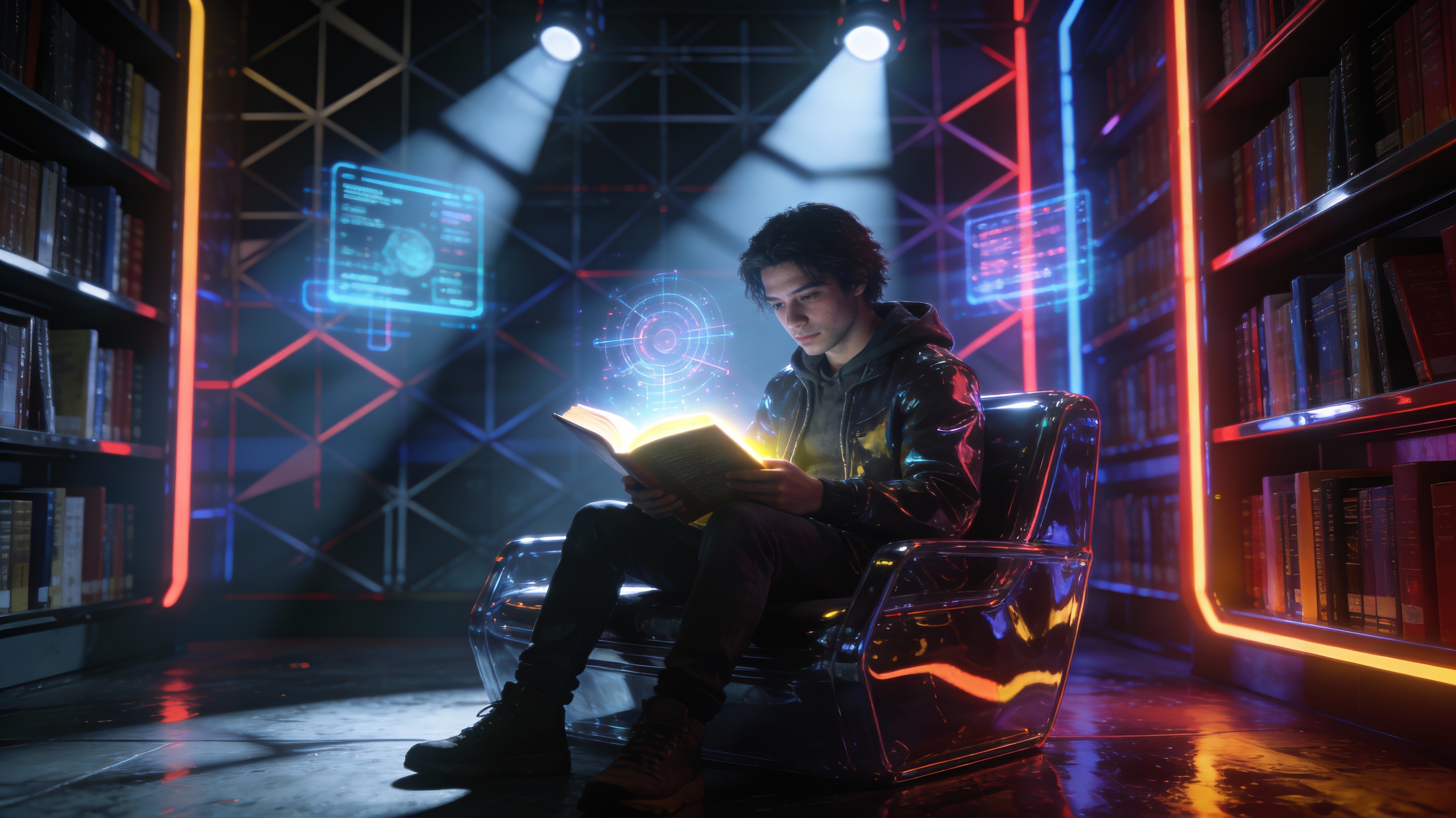
What's wrong:
- Lighting is overly dramatic (movie poster style)
- Too much detail in every corner
- Strong 3D render feel
- Looks "fake" — no human touch
The fix is simple: subtract detail, add texture, flatten, desaturate.
Below are 3 ready-to-use style recipes using the same "reading" theme:
Style 1: Minimal Vector Flat
Best for: Tech blogs, professional content, product introductions
The safest, most modern choice. Removes all unnecessary dimensionality — clean, simple, professional.
Looks like: Notion illustrations, Apple website graphics, corporate UI design.
Prompt Suffix:
flat vector illustration, minimal style, corporate memphis, simple shapes, 2D, white background, wide margins, clean lines, matte finish, low saturation, soft pastel colors, no shading, Behance style --ar 16:9
Example — same "reading" theme with flat style:
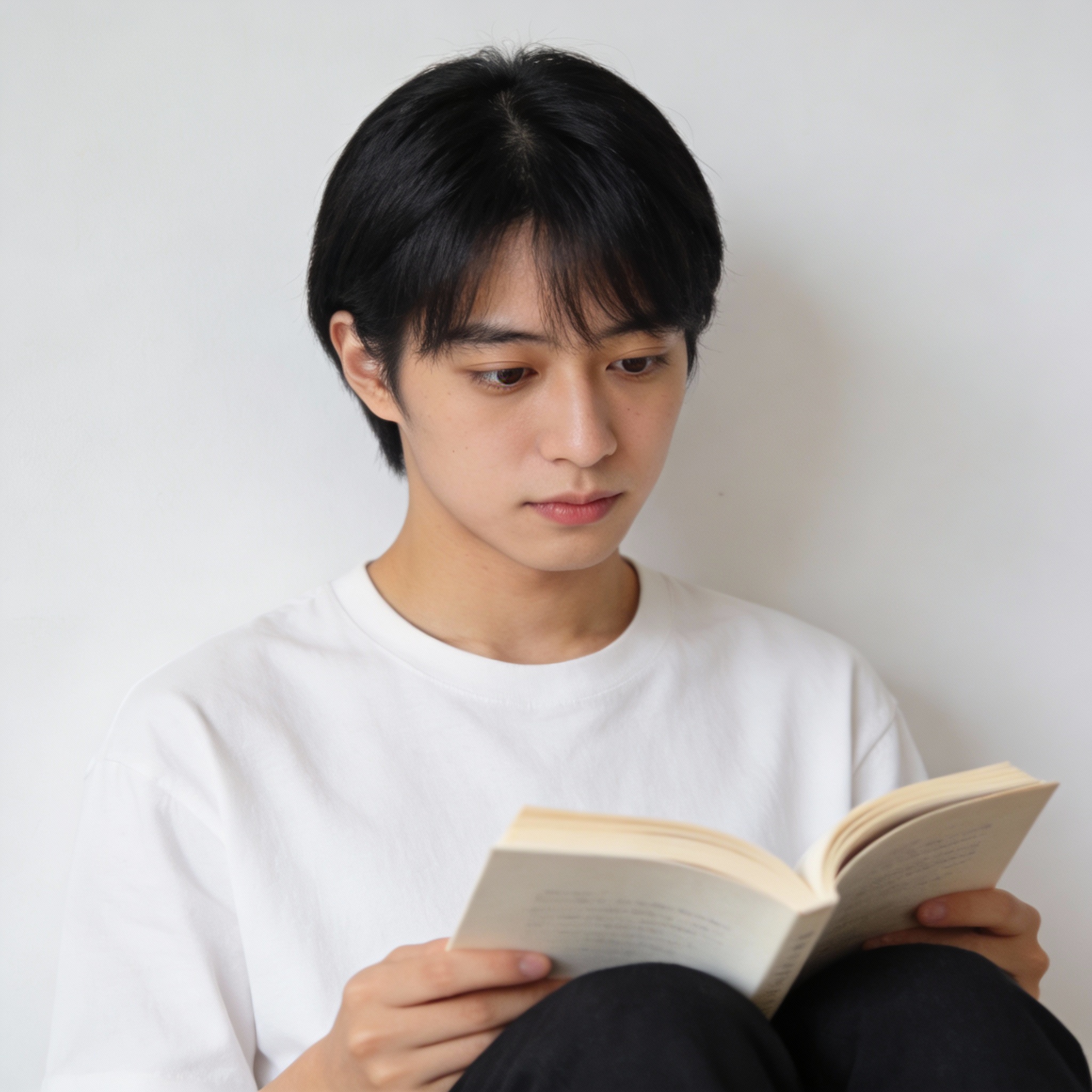
Compared to oily version: No 3D render feel, no dramatic lighting, clean and professional.
Style 2: Hand-drawn Crayon / Watercolor
Best for: Lifestyle content, book notes, personal stories
Simulates real art materials (crayons, pencils, watercolors) to introduce intentional "imperfections" — textures that eliminate the AI plastic smoothness.
Looks like: Children's book illustrations — rough edges, warm tones, not-quite-perfect but incredibly approachable.
Prompt Suffix:
hand-drawn sketch, crayon texture, watercolor style, children's book illustration, rough edges, textured paper, visible brush strokes, warm tones, cozy atmosphere, simple composition, cute and friendly --ar 16:9
Example:
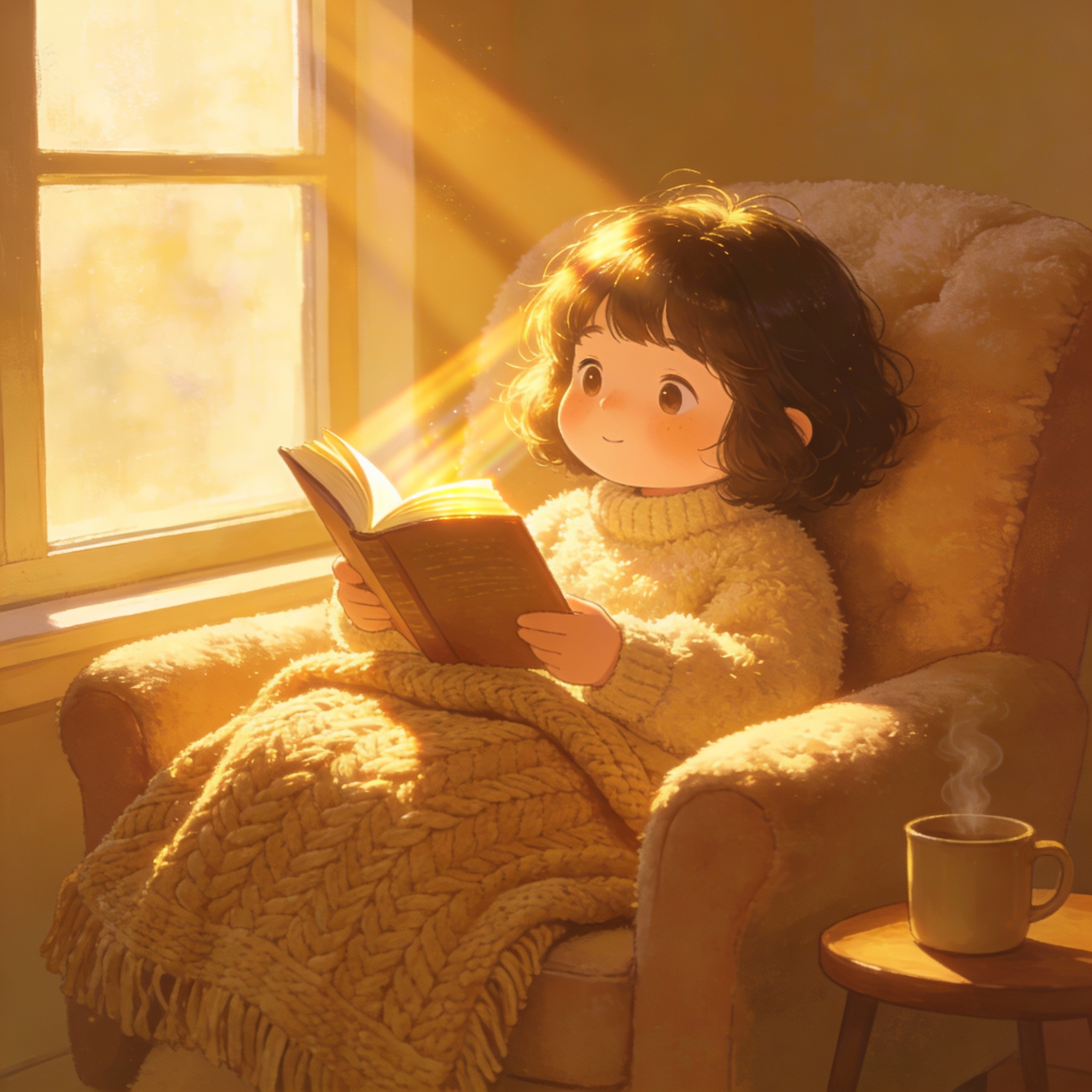
Compared to oily version: Real textures and brush strokes, warm tones, looks genuinely hand-drawn.
Style 3: Risograph (Screen Print)
Best for: Opinion pieces, creative writing, artistic content
The ultimate anti-AI weapon. Risograph style forces limited color palettes and grain, making images look like vintage print — sophisticated and zero AI sheen.
Looks like: Indie magazine illustrations, art posters — grainy, 2-3 color separation, slightly misaligned layers.
Prompt Suffix:
Risograph style, grain and noise, screen print texture, limited color palette (blue and orange), halftone pattern, abstract minimalism, vintage aesthetic, matte paper texture, high contrast, flat illustration --ar 16:9
Example:
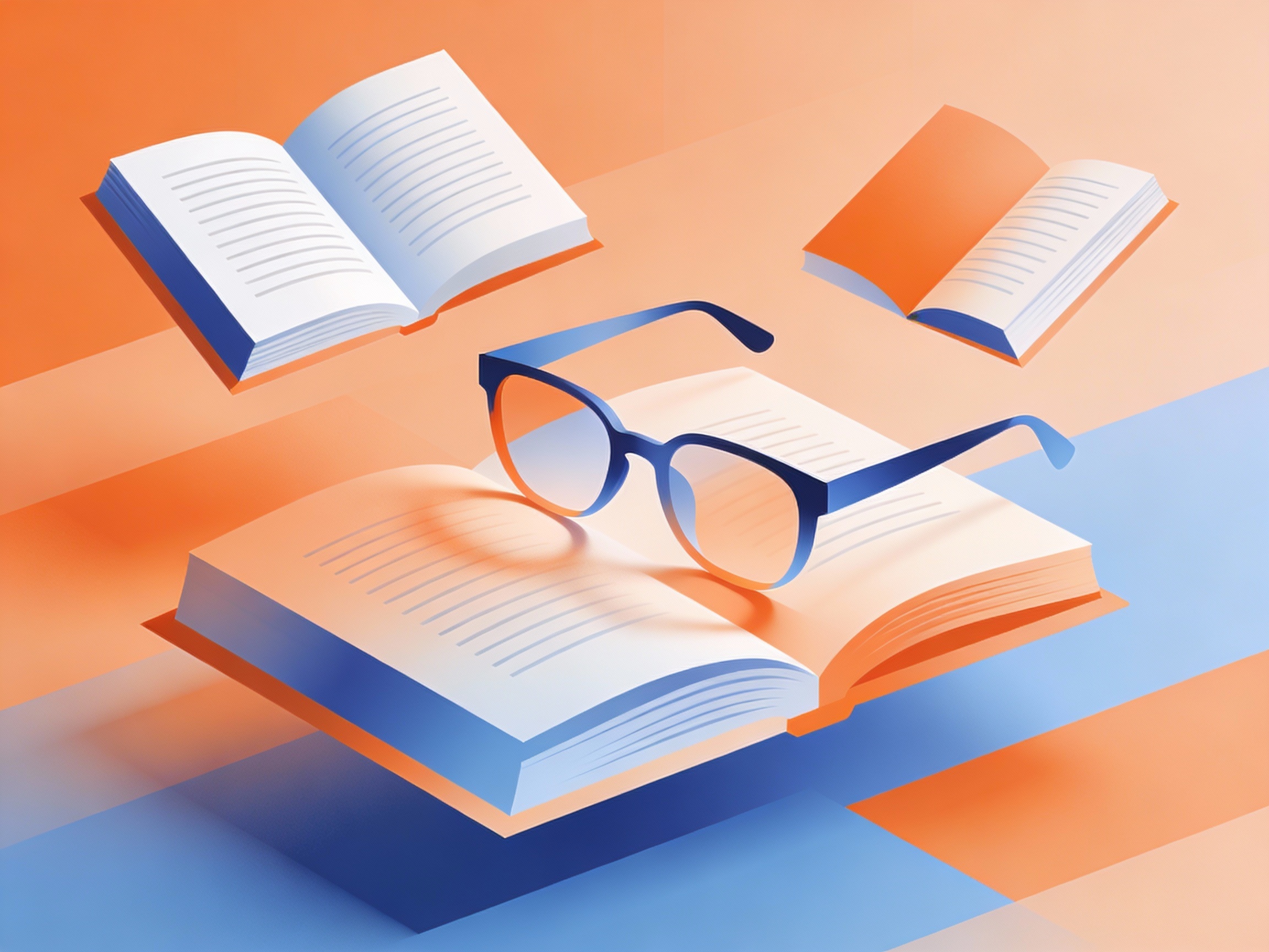
Compared to oily version: Grain and print texture, limited color palette feels more artistic, zero 3D render plastic feel.
Quick Reference: Anti-AI Magic Words
Must-have texture words
Matte(removes reflections)Grainy / Noise(adds realism)Textured paper(physical feel)
Lighting control
Flat lighting(avoid dramatic shadows)Soft shadows(gentle transitions)Natural light(real-world feel)
Negative prompts (tell AI what NOT to do)
photorealistic, 3d render, octane render, unreal engine, shiny, glossy, reflection, hyper detailed, neon lights, cyberpunk, plastic looking, oily skin, complex background
Simply put: tell AI "don't make it look too real, too 3D, too shiny, or too complex."
Summary: 5 Anti-Oily Principles
Making AI images look human-made is simple — make them look like they were drawn, not rendered.
- ✅ Add texture — paper grain, canvas, noise
- ✅ Subtract detail — leave some "imperfections"
- ✅ Desaturate — muted colors are more friendly
- ✅ Flatten — 2D beats 3D for authenticity
- ✅ Matte finish — remove highlights and reflections
Remember: imperfection is realism, and realism is the most friendly.